To understand the history of typography and the anatomy of typefaces, I was tasked to design Type specimen posters for three different fonts, A serif, a sans-serif, and a display typeface. The Posters showcase all of the individuality of the typefaces and talk about their history and creators. The typefaces on display are Trixie, Raleway, and Bickham Script.
Choosing our players
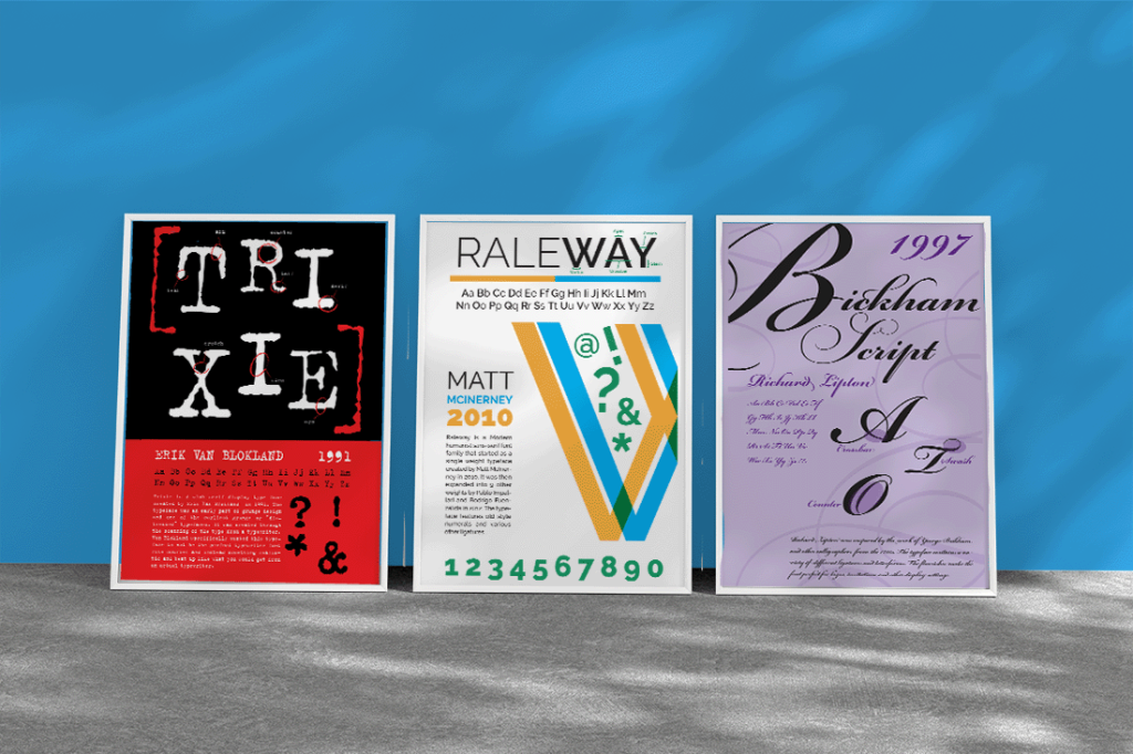
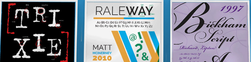
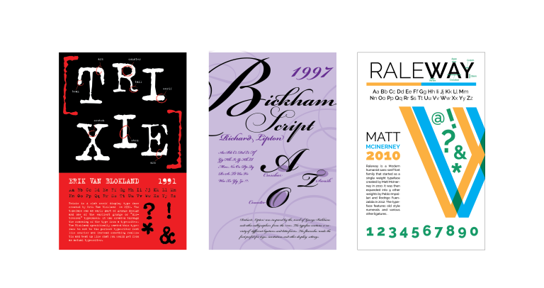
Immediately Raleway stuck out as the Sans-Serif font that I wanted to make a poster for. It is a super versatile font with multiple weights and one that can double as both a body copy and as a heading. It is also one of my favorite fonts (as seen in how often I use it). Trixie stood out to me because of the juxtaposition of it next to Raleway, they are vastly different fonts with completely different vibes. Bickham script fit right in as a third ‘individual’ in the set. The three fonts bring different things to the table and it was my goal to showcase that in my designs.
A Set of Individuals
While designing, the goal was always to keep the differences between the three fonts clearly visible. Trixie changed a lot throughout the iterations but still maintained the grungy style of the font. For Raleway, there was a clear idea that I wanted to develop with the letter w being split in half. Sadly the intersection of the W wasn’t as perfect as it seemed so I instead chose to just duplicate the W in the center. This limited the space for other content though so In the end I moved the W to the side and switched to an uncentered design. Bickham script is a font with a lot of personality and Ligatures so I knew from the beginning I had a lot to work with. I used the name of the font as the main focal point and the ligatures and extra elements as accents to the main layout.
The Finished Trio
The finished set was not what I expected, I thought I’d end up unhappy with all of them except Raleway, just because of how much I like Raleway as a font but I was actually quite happy with the final result for all of the posters. The final 3 showcased very different fonts, layouts, and just many different aspects of design that I improved on throughout the project.