Home
Home
About
About
Works
Works
Contact
Hi, I'm Estefany.
I solve problems.
Check out
what I can do
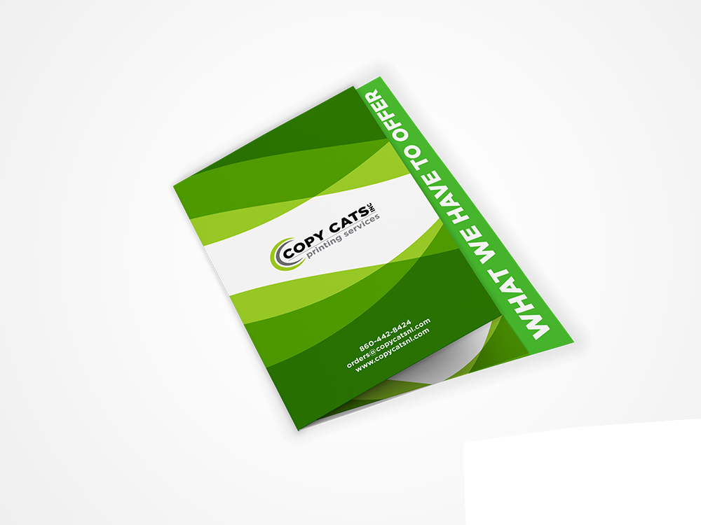
Copy Cats Inc. Brand Refresh
Branding
Print Design
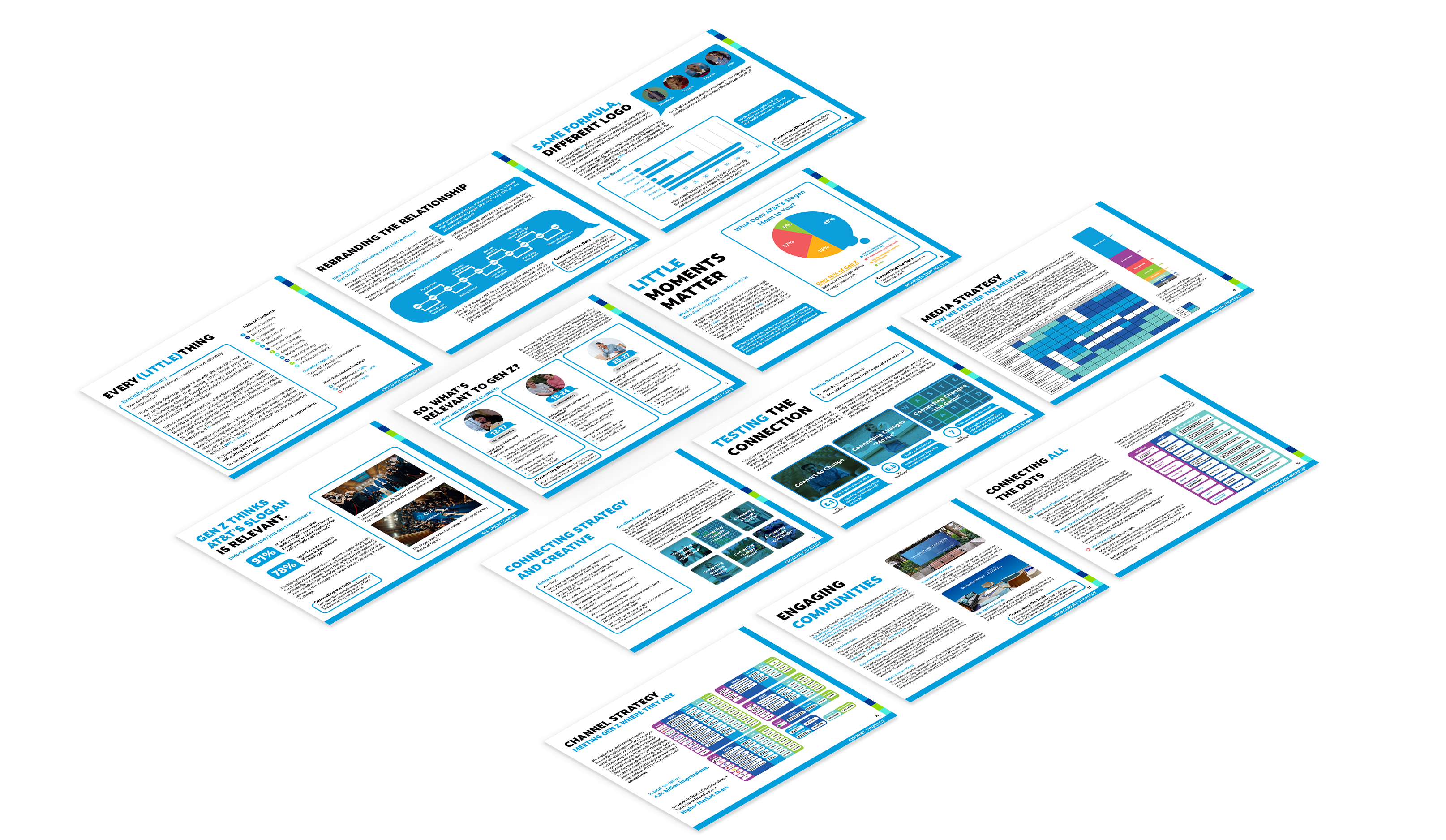
NSAC Work
Advertising
Print Design
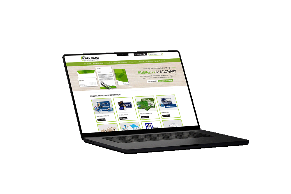
Copy Cats Inc. Website
Web Design
UI/UX Design
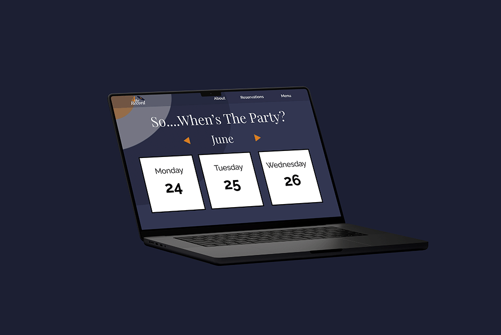
4theRecord
Branding
Web Design
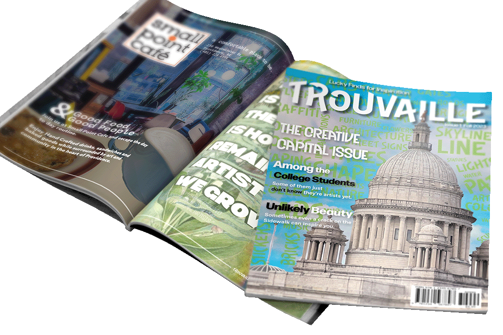
Trouvaille
Branding
Editorial Design
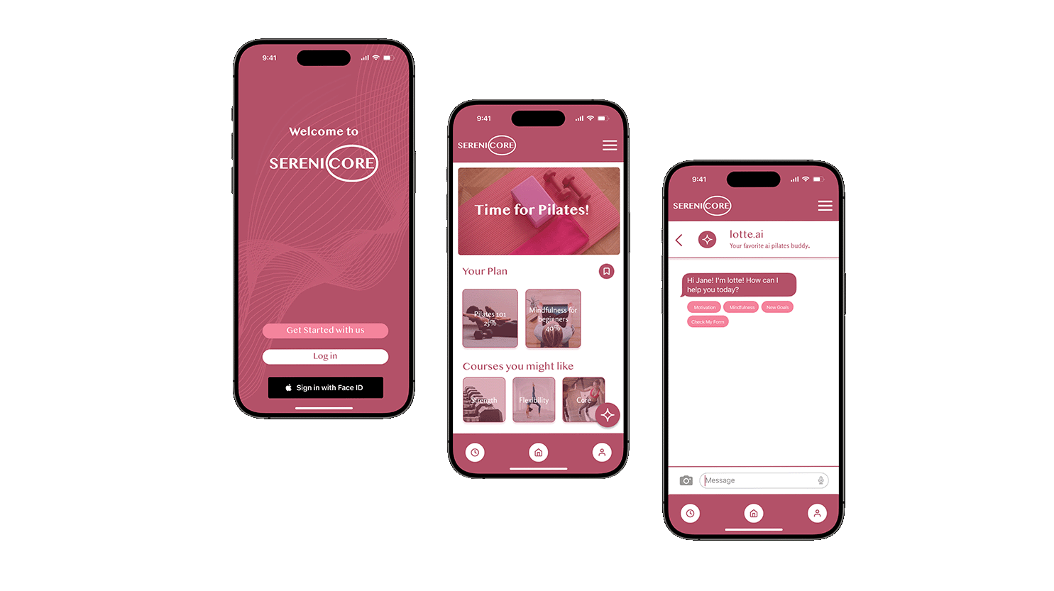
Serenicore
Branding
UX Design
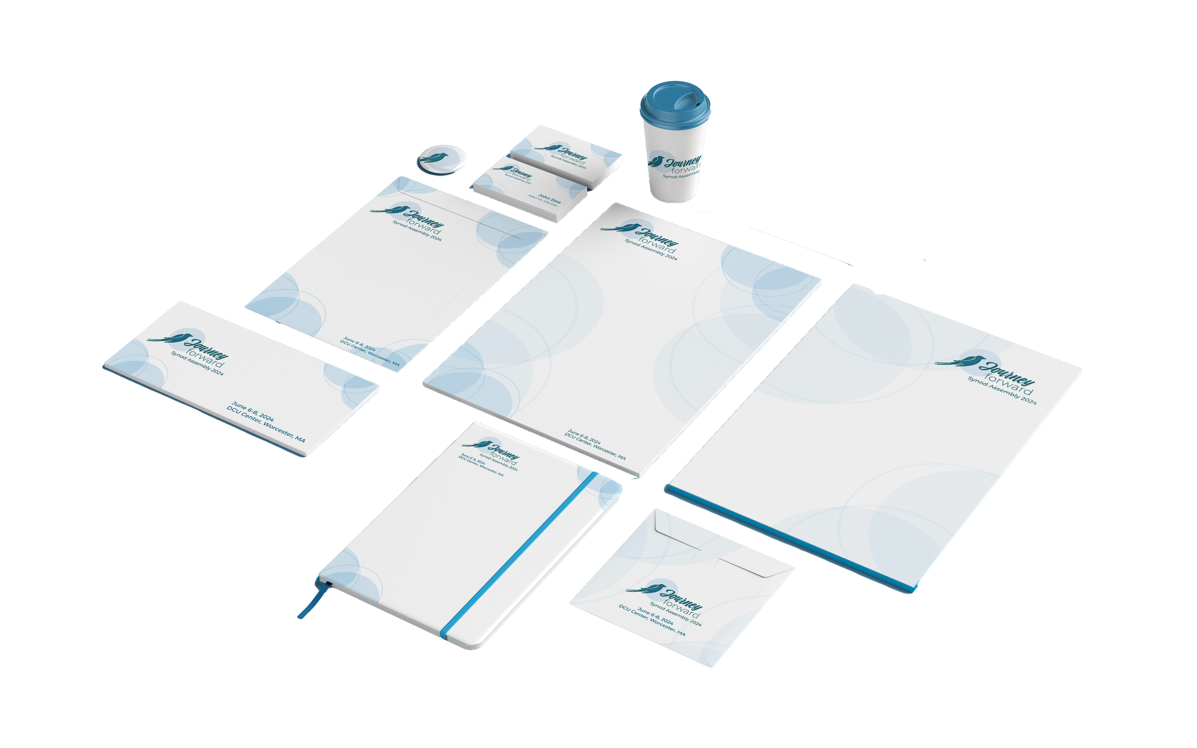
Journey Forward
Branding
Print Design
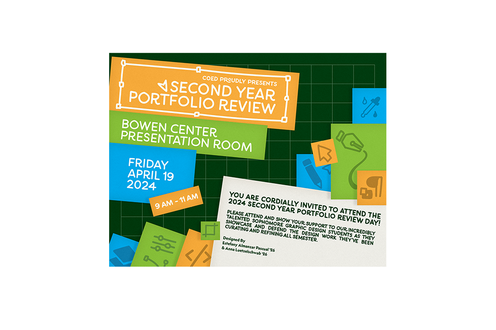
Portfolio Review
Print Design
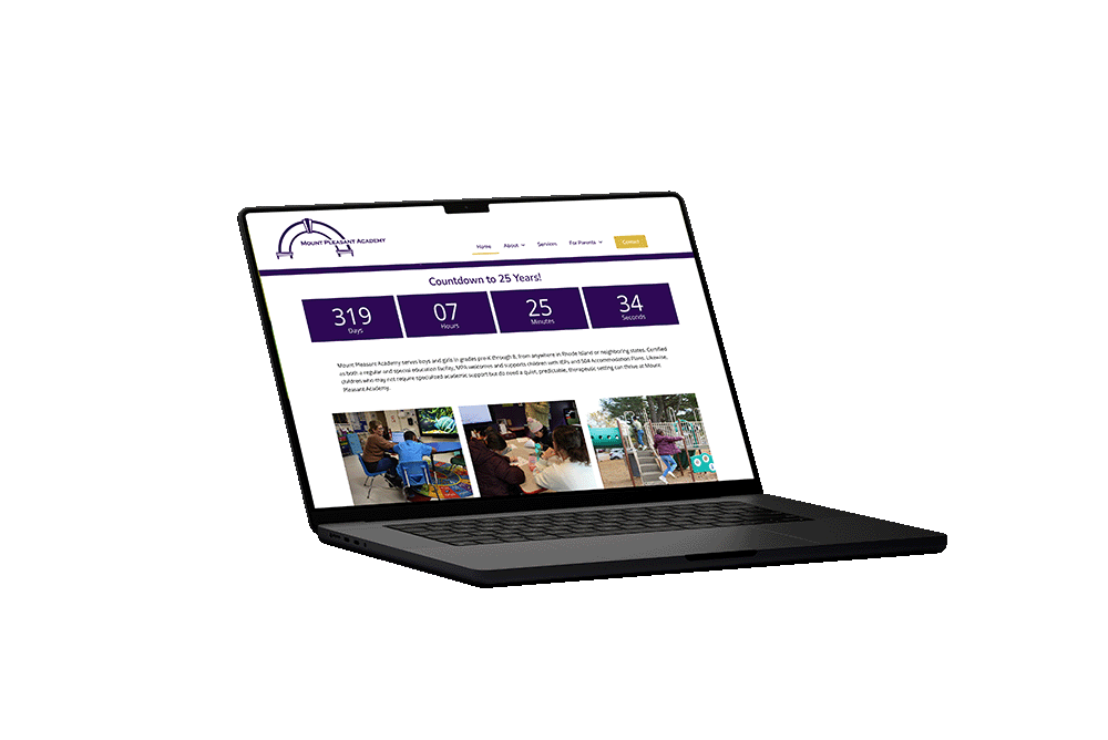
Mount Pleasant Academy
Web Design
Web Development
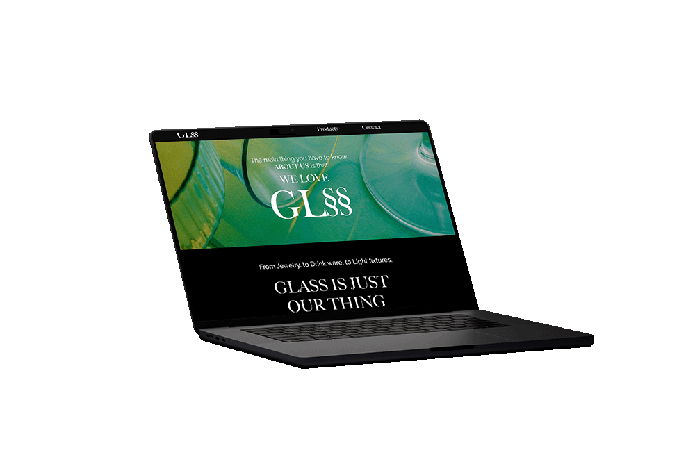
GLSS
Web Design
Web Development
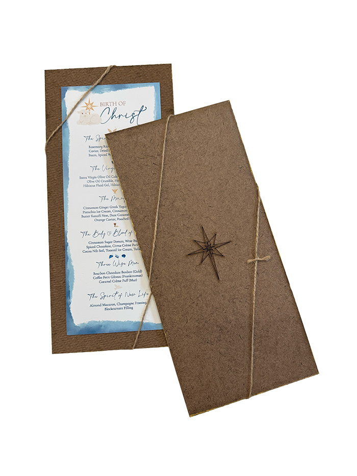
Birth of Christ
Print Design
Chaos Media
Branding
Social Media Design