
Interactive Restaurant Website
Web Design Branding
Figma, WordPress, Adobe Illustrator
MORE THAN A RESTAURANT, AN EXPERIENCE
When diners eat at a high-end restaurant, they know what to expect; small tables, even smaller portions, classical music, candle-lit ambiance, and a high price tag. 4theRecord wants to be more than that. 4theRecord wants to be the kind of place where you’re not just here for the portions you are here for the entire experience. 4theRecord is a culinary experience, a concert, and an art exhibit all in one.
4 THE MUSIC & ART LOVERS
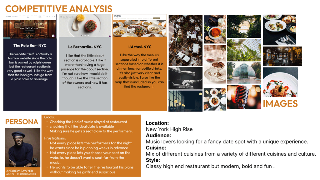
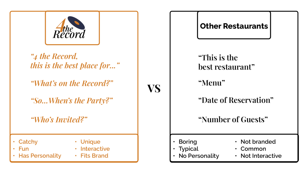
Tasked with designing a restaurant website, I knew immediately that I had to think outside of the box to create a stand-out site. Early research showed various examples of boring restaurant sites that lacked personality and interactivity. Wanting to create something bold, fun, and interactive, I created 4theRecord, a customizable dining experience for music lovers and just anyone looking for great food.
THE VOICE
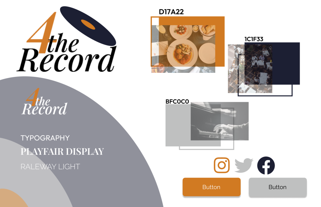
The name made the entire branding come quite naturally. “For the record”, a phrase meaning that you want something to be clearly expressed or made known to others, quickly became “For the Record” showing the musical influence and inspiring some puns and a unique brand voice. And through the design process, it turned into “4theRecord”. The change of ‘For’ to “4” made the brand voice clearer and created a more playful, modern image than that of other fine dining restaurants. Using a simple illustration of a vinyl record helped play into the musical aspect even more. The logo design set the stage for what the rest of the site would be.
BALANCE BETWEEN MODERN AND CLASSIC
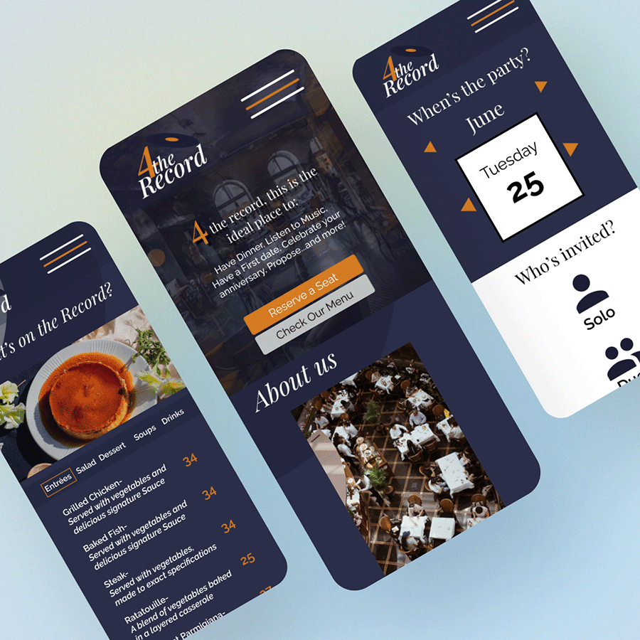
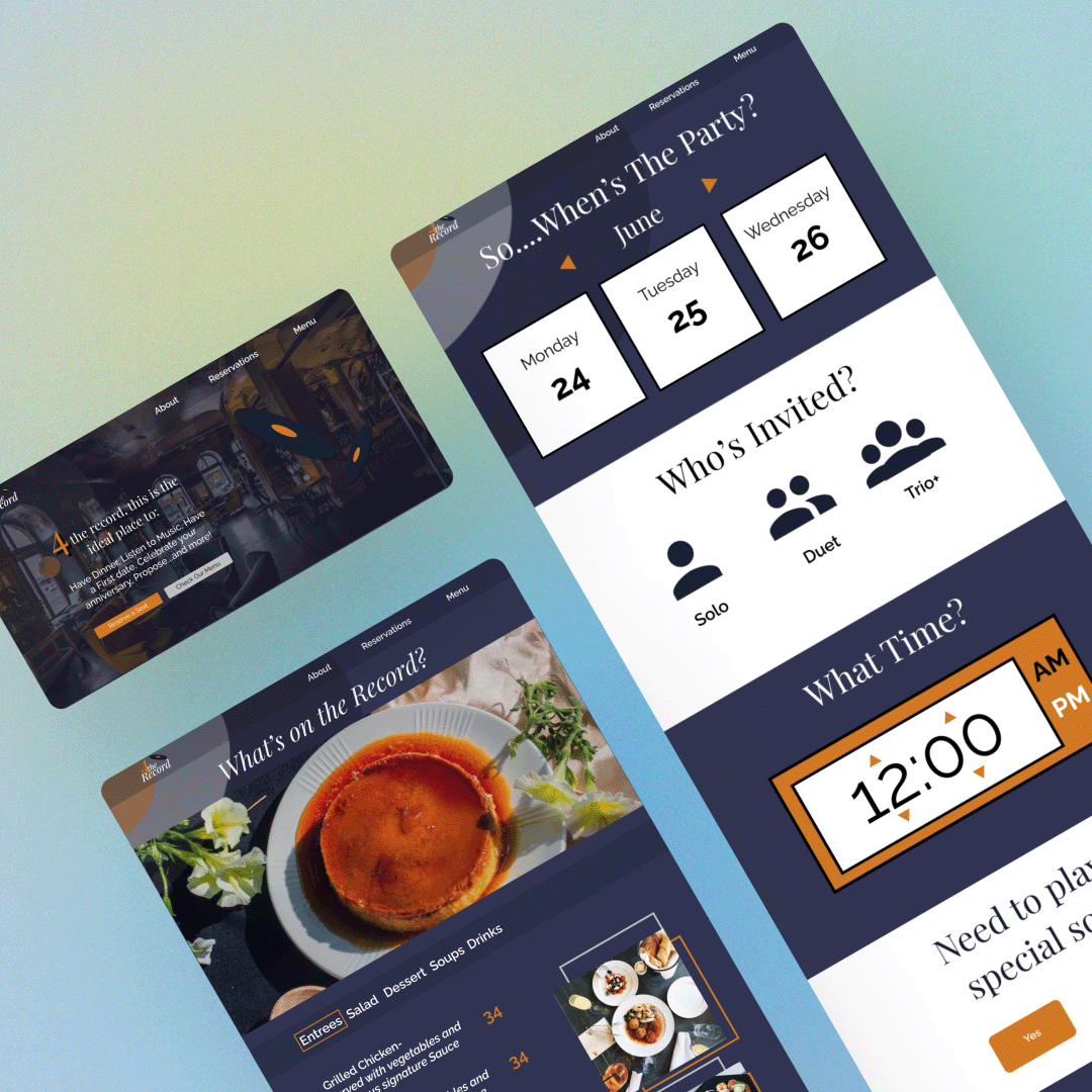
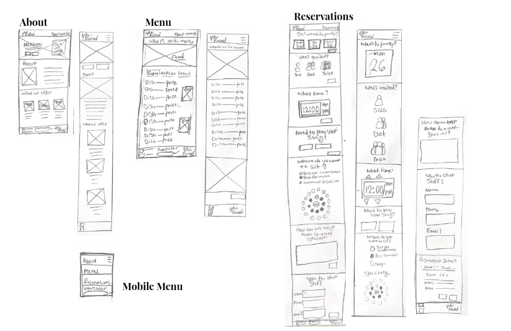
4theRecord as a brand is both fun and elegant and that needed to show through the rest of the site. The goal was to have 4theRecord be clearly within the category of ‘fine dining’ but also completely on a different level. Through preliminary sketches, this was achieved by creating an About page and a Menu page that fit the standard for fine dining websites but still stood out. The brand voice and color palette were the keys to achieving this. The use of Navy, White, and Gold throughout the site created a feeling of sophistication and elegance that contrasted with the playful copywriting and bold interactive features of the site. This use of color and copywriting in the About page and Menu page specifically, allowed the two pages to be unique while remaining relatively simple. These two pages were meant to fit the mold of a simple restaurant website. The final page of the project was the most interactive page by nature and it was my goal to have it reach a whole new level of interactivity.
CUSTOMIZATION AND INTERACTIVITY
For most restaurants these days the reservations are handled by third-party services or simply rely on simple forms but 4theRecord as a brand was different and the reservation page was the best place to show that. What would’ve been a few simple forms and dropdowns was turned into a whole experience by stylizing every step of the reservation process. The copywriting was vital to this page because instead of having paragraphs about the brand story or lists of different dishes and prices like on other pages, this was a page that was focused on the user and their experience of the brand. “When’s the party?”–Date of reservation–, “Who’s invited?”–Number of people—,”What time?”, and then “The other stuff”–contact information– made up the classic information reservation pages ask but remember– 4theRecord is a little different. Customizability and Interactivity were at the forefront of 4theRecord’s image so there were even more questions and options asked on the page. From the option to request a special song, to being able to choose exactly where you want to sit based on how close you want to be to the live band, every part of the experience was customizable and interactive. And just in case those questions didn’t cover all the bases, there’s another section for how 4theRecord can make your night even more magical.
SKETCH TO PROTOTYPE
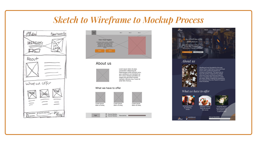
From my sketches, the wireframes came quite easily, the general shapes were simple and the ideas were clear but from the wireframes to the Figma mockups is where you can see the pages come to life. Even just colorizing the wireframes completely changed how everything looked but additions like the offset frames of images and the lower opacity records in the background of the site created depth and texture that the site was otherwise lacking. It was my first time using Figma so I was at first frustrated with what the program could not do design-wise in comparison to programs like Adobe Illustrator but the learning curve was easy to overcome. Typography was another major part of what made the website come to life. Playfair Display and Raleway are both incredibly classic fonts but the way they came together as a classy serif and a very modern sans serif just changed the way everything looked immediately. Figma Prototyping was really where I had the most fun. The site already looked interactive but being able to actually make it interactive just elevated the entire site. The prototyping helped set the site apart, from something as simple as the hamburger menu to more complicated parts like selecting a time on the reservation page.
THE SITE COMING TO LIFE
The next step was to move the site from Figma Prototyping to WordPress with Elementor. This wasn’t too difficult because the whole site had already been designed. The only real issue was with trying to adjust to yet another set of program limitations. Elementor has stricter grids and more limitations to placement when it comes to design than Figma does so it was hard to get used to. In the end, moving into Elementor Pro and being able to apply different plugins and features made the site come together.
REFLECTION
This was the project that really sold me on web design as my concentration. It was my first experience with designing a proper website and it inspired me to continue on the web focus. I loved how interactive my final design was and being able to design for user experience was brand new to me but also just so rewarding. I received lots of positive feedback on the interactive features of the site and the creativity of the brand and It was an incredibly valuable project for me as a designer.